What a Founder Performance Dashboard Should Actually Show
At 8:10 on Monday morning, a founder opens four reports. Sales has listed the calls made, meetings attended, and quotations sent. Operations has recorded the jobs completed and deliveries dispatched. Finance has shared the latest receivables report. Customer Service has counted the complaints closed.
Every report contains information. Yet the founder still cannot answer five critical questions:
- Will the business have enough cash to meet its commitments?
- Are sales likely to reach the month’s target?
- Are those sales producing an acceptable margin?
- Are important customer promises at risk?
- Which problem genuinely requires the founder’s decision?
The founder has reports. The founder does not yet have visibility.
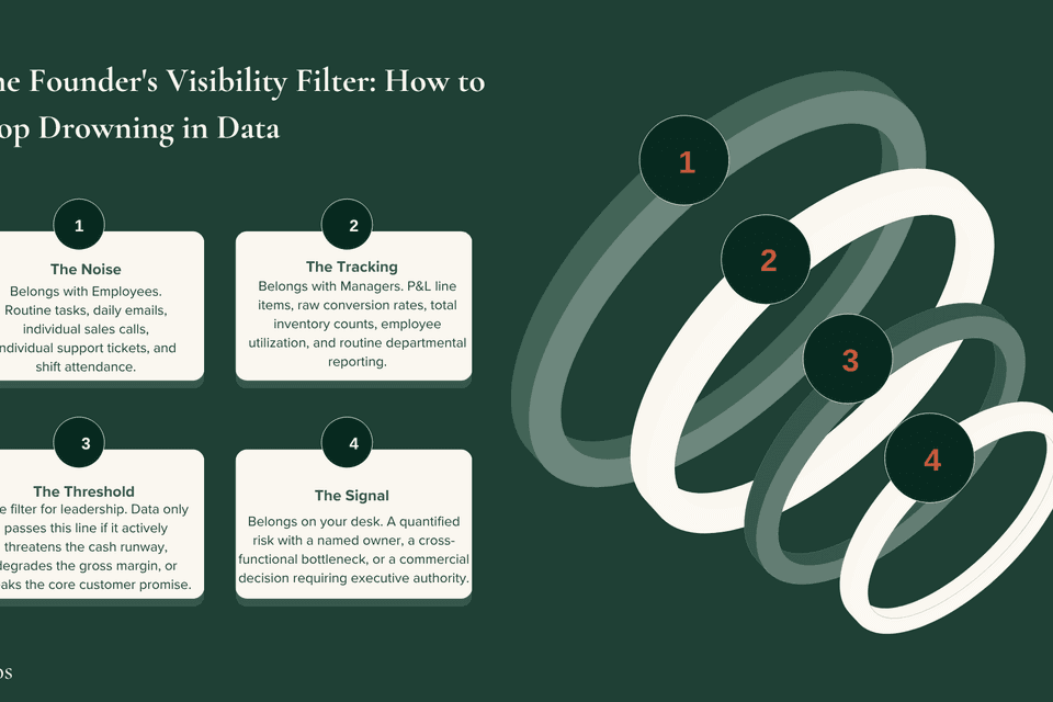
A founder cannot personally monitor every employee, customer, order, expense, project, and operational detail. Trying to do so does not create control—it turns the founder into the company’s reporting system. A useful founder performance dashboard must do something more disciplined: it must reduce the whole business to the few outcomes, drivers, risks, and decisions that leadership needs to see early enough to act.
A Dashboard is Not a Collection of Every Metric
One of the easiest ways to build a useless dashboard is to include everything that can be measured.
The business begins with eight metrics. Then Sales asks for seven more. Finance adds five ratios. Operations adds delivery, productivity, inventory, and quality measures. HR adds attendance and training figures.
Before long, the founder receives a dashboard with 40 numbers, 12 charts, and six pages of explanation. Nothing is technically missing, but the founder cannot immediately see what matters.
If a number changes and nobody knows what decision or action it should trigger, it does not belong on the founder dashboard.
The dashboard should not attempt to represent the entire company. It should represent the company’s current priorities and material risks.
The Five Founder Visibility Questions
There is no universal list of "ten KPIs every business must track." The exact measures must reflect how your company makes money, what limits its growth, and what risks could damage cash or reputation.
However, while the exact metrics differ, every founder dashboard should answer five non-negotiable questions.
1. Do we have enough cash to meet our commitments?
Revenue is not cash. A business can record a profitable sale today while waiting several weeks to receive the money. The founder does not need to approve every payment, but they must see whether the business can meet its near-term obligations.
At a minimum, the dashboard should show:
- Cash currently available
- The lowest forecast cash position (using a rolling 13-week cash-flow forecast)
- Overdue customer receivables
- Large payments or obligations approaching
The founder-level question is not: "What is our bank balance today?"
It is: "Based on what we currently know, when is cash likely to become constrained, what is causing it, and what action are we taking?"
2. Is the business generating enough healthy demand?
By the time a monthly revenue report confirms you missed the target, the opportunities that could have rescued the month have gone cold. Revenue is a lagging result.
The dashboard needs one final commercial outcome (e.g., Revenue, Confirmed Orders, Renewals) and one or two earlier drivers (e.g., Qualified Sales Pipeline, Proposals Awaiting Decisions).
Reporting that the sales team made 187 calls is useless activity data. A credible pipeline, customer movement, and conversion rates are evidence of commercial progress.
3. Are we making economically healthy sales?
A company can grow revenue and still become financially weaker. This happens when growth is supported by excessive discounts, emergency purchasing, unpriced rework, or customers who pay too slowly.
The founder dashboard must show the quality of revenue, not just the quantity.
If revenue is on target but gross margin has fallen from 31% to 27%, the dashboard should reveal the driver: Has supplier pricing increased? Has the product mix changed? Is a large customer receiving terms the business can no longer afford? A revenue number creates celebration. A margin number asks whether the celebration is justified.
4. Are we keeping the promises that protect customer value?
Every business has a core promise that customers are paying it to keep (e.g., on-time delivery, project milestones met, service-response time). The founder dashboard should contain one or two measures showing whether that promise is being kept.
You should not receive a list of every customer complaint. You should see:
- A material change in the pattern of complaints.
- A high-value customer at risk.
- A cross-functional breakdown (e.g., Sales, Operations, and Finance working from incompatible commitments).
5. Where is execution drifting, and who owns the recovery?
A dashboard becomes passive when it only displays results. A red metric shows you something is wrong, but it doesn't show whether the business is actually managing the problem.
Every material amber or red item should answer: What is the cause? Who owns the recovery? By when? What decision is required?

The Visibility Rhythm
A metric should be reviewed at the speed at which the business can still do something useful about it. At Talentos, we install a four-level rhythm:
- Daily (Manage Exceptions): Monitor cash on hand, critical stockouts, or severe delivery failures. Manage by exception, not inspection. If the founder must study the entire business every morning to discover what is wrong, the system is broken.
- Weekly (Manage Execution): Review the commercial pipeline, short-term cash forecast, and material drift. Managers should not read their reports aloud—they should explain what moved, what is at risk, and what action is already underway.
- Monthly (Examine the Truth): Review completed financial information (P&L, Balance Sheet, completed margins). The weekly review asks, "What must we correct while the period is moving?" The monthly review asks, "What did the business actually produce, and why?"
- Quarterly (Reset the Dashboard): Has the main business constraint changed? Are managers beginning to manipulate activity to improve a number? The dashboard should follow the strategy; the strategy should not become trapped inside the dashboard.
Stop Building the Dashboard Yourself
A common mistake is to build a founder dashboard that still depends on the founder to assemble it. If you request figures from Finance, follow up with Sales, correct Operations, and combine everything into one document yourself—the business is still completely founder-dependent.
Managers must own the accuracy of their measures and the explanation of material variances. The founder owns the company priorities, strategic trade-offs, and decisions above management authority.
Delegation without visibility feels reckless. Visibility without delegation becomes micromanagement. The founder dashboard must make both possible: room for managers to manage, and enough evidence for the founder to lead.